A COOLER BLOG - INTRODUCING MY DISPATCHES
Meet Luqman’s Dispatches - the new, cooler blog.
2025 is the year of overhauls and changes - I’ve published two posts in the topic of a blog overhaul alone, I switched to a new school, and change is happening at an alarming rate. I’m not sure what caused the overhauls, perhaps I am changing too quickly to the point where my identity is corroding away? Not entirely sure. Regardless, Dispatches was developed to be a long-term solution, utilising every technical and aesthetical feature that I need and want for a polished, functional blog website.
TECHNICAL
As I’m building this from scratch, I took the opportunity to do it right. Once and for all. At last.
UTILISING JEKYLL TO ITS FULL POTENTIAL
Dispatches is built using Jekyll, a static site generator that transforms text written in Markdown or HTML into a complete website. Like the predecessor, Jekyll was chosen as it has a built-in blogging feature, reducing development complexity whilst allowing me to modify it according to my requirements. It also allows custom layouts, therefore allowing me to customise the look and feel of the website.
Another Jekyll feature I utilised extensively this time is includes. It allows some HTML code to be bundled together and included in the layouts. Useful, simplifies code.
REWORKED POST URLS
My blog used the default Jekyll posts URL style (website.com/category/YY/MM/DD/title) which is unnecessarily long and verbose. It doesn’t really matter when the post’s release is to the browser, as long as the URL is unique to that post. To solve this, I’ve edited the permalink for posts, emphasising only on the category and title, so it looks like website.com/category/title.
NO MORE RGB() CLASSES
Unlike the blog which has the rgb values of the theme colours replicated on all components (text-[rgb(50,50,50)]), Dispatches utilises Tailwind classes which makes the codebase less verbose (now uses text-smokey).
AESTHETICS
The new design is based on the predecessor, therefore maintaining that technical, seamless look and feel inspired by terminal user interfaces (TUIs) as well as the layout. The stark contrast is the latter replicated the TUI aesthetic almost literally - with the font size standardised (Tailwind CSS text-lg), requiring different colors, bold fonts, and underlines to differentiate between text hierarchies. Moreover, the almost literal replication results in the design to be relatively minimal, with fewer colors, and an emphasis on text over shapes.
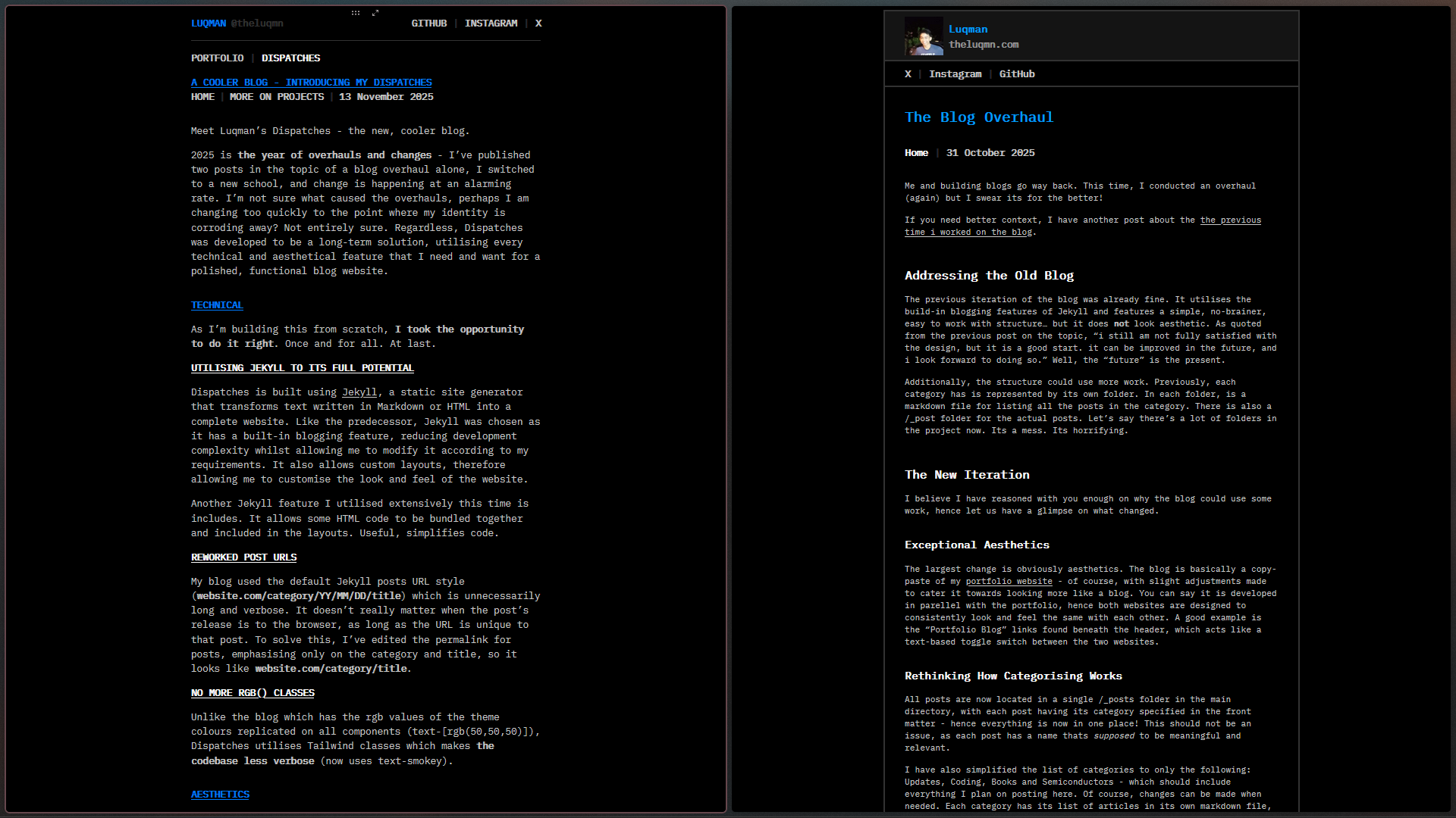
Side-by-side comparison between Dispatches and my blog:
BUILT FOR LONGETIVITY
Dispatches is built for longetivity. It is structured to be easily modified without requiring major changes, or anything breaking. Everything from the name, technicalities as well as the aesthetics are built to be timeless, and modularised to the codebase level. In the upcoming few years, I will be emphasising on projects, academics, as well as personal happiness over redoing things that I have considered done a couple weeks ago. This is for the long-term.
Thanks for the read! See you again on the next post.